The Art of the Cinematic Campaign: A Deep Dive into Fall 2026 Movie Poster Design
As the autumn leaves begin to fall and the film industry pivots toward its high-stakes awards season, cinephiles find themselves navigating a delightfully erratic release calendar. While the autumn months are traditionally dominated by the dark, atmospheric marketing campaigns of the horror genre, this year’s theatrical landscape offers a fascinating counter-programming strategy. Rather than cramming every prospective blockbuster and prestige title into a congested December window, studios are spacing out their releases, resulting in a rich, unpredictable tapestry of cinema hitting screens week by week.
This fragmented scheduling demands vigilance from moviegoers. Local listings must be checked regularly lest a compelling indie feature or limited-run awards contender sneak onto a single screen for a fleeting week-long engagement before disappearing into the ether. In this climate, the movie poster once again assumes its vital historical role as both a beacon and a work of art.
Let us examine the topography of the current cinematic marketing landscape—broken down through pairs, illustrative prints, and spatial compositions—as graphic designers and boutique agencies shape our expectations for the films defining the final quarter of the year.
The Chronology of Fall Marketing: Pacing the Sprint to Awards Season
The rhythm of movie marketing follows a strict chronological cadence closely tied to the festival circuit. Late summer sets the stage with teaser campaigns arriving out of Venice, Telluride, and Toronto, building a slow-burn awareness that culminates in October.

- Early October: Studios kick off the month with high-concept indie projects and targeted platform releases. Films like Digger (releasing October 2) and You Can See Everything (limited on October 6 before expanding October 23) establish the baseline, relying heavily on striking minimalist aesthetics or psychological intrigue to capture early adopters.
- Mid-October: The calendar broadens significantly. October 9 brings a diverse wave of titles—including Other Mommy, The Social Reckoning, Big Girls Don’t Cry, Winter of the Crow, and Naza—forcing audiences to choose between genre thrills and heavy, thought-provoking dramas. This is swiftly followed on October 16 by counter-punch releases such as Street Fighter, Sense and Sensibility, and Ignasi Monreal’s painted teaser rollout for La Bola Negra.
- Late October: The sprint solidifies heading into Halloween week with major prestige plays and artistic swings like Wicker (October 23).
This carefully calibrated rollout prevents market saturation, allowing individual graphic design campaigns room to breathe and capture the cultural conversation.
Pairs: The Kinetic Energy of Dual-Character Dynamics
One of the most compelling trends in recent poster design is the pairing of contrasting visual strategies to sell a film’s central relationships. Designers are increasingly moving away from standard, floating-head floating-body photo composites in favor of dynamic compositions that evoke mood and kinetic motion.
Big Girls Don’t Cry and Sense and Sensibility
Midnight Marauder’s teaser for Big Girls Don’t Cry (limited release October 9) subverts traditional framing by cropping its subjects. The actors’ faces are pushed to the extreme edges of the frame—one blurred in motion on the right, the other peeking up from the bottom. It captures a fleeting moment of rest against a tree, relying on atmosphere over explicit plot points. The title treatment utilizes tight leading where each word kisses the next, forming a distinct field of color that contrasts with the surrounding magenta and skin tones, creating a visual "X" of human interaction.
Conversely, Empire Design’s poster for Sense and Sensibility (October 16) places its subjects dead in motion. Esmé Creed-Miles and Daisy Edgar-Jones sprint across the screen, their flowing dresses creating vibrant green and purple fields that bisect the frame diagonally. This kinetic energy stands in sharp contrast to P+A’s more static, Andrew Wyeth-inspired compositions of actors lying in the grass or posing on a couch in close-up. While the period-specific serif fonts of the static posters possess undeniable charm, the sheer joy and motion of the teaser capture a vital, beating heart.

Wicker
GrandSon’s one-sheet for Wicker (October 23) achieves a similar feat through sensual abstraction. Featuring Olivia Colman and Alexander Skarsgård in a breathless embrace, the poster frames a frozen moment within a dance. The juxtaposition of Skarsgård’s wicker-woven face against Colman’s pale skin evokes a haunting, modern-day Beauty and the Beast.
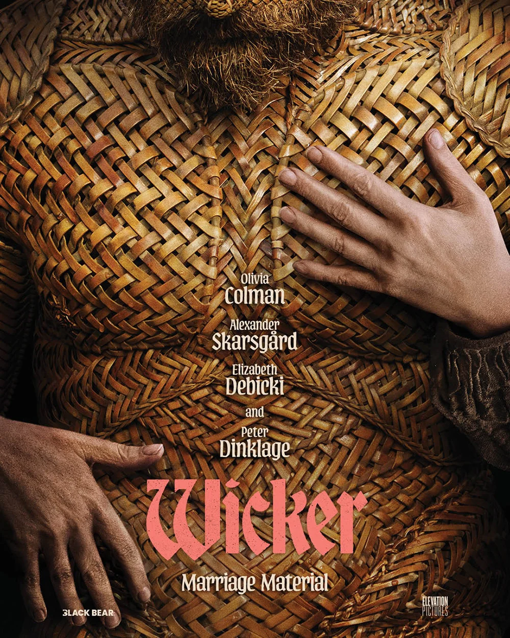
Empire Design’s alternate teaser—featuring Skarsgård’s wicker-woven chest filling the page as hands reach in from the margins—creates intrigue through pure conceptual absurdity. It feels less alluring and more protective, presenting a wounded vulnerability that lingers in the viewer’s mind long after glancing away.
Prints: The Renaissance of Grassroots and Illustrative Aesthetics
In an era dominated slick, hyper-polished digital rendering, a refreshing counter-movement has emerged. Designers are looking backward to archaic printing techniques, woodcuts, and Xerox flyers to lend their campaigns a tactile, handmade quality.
+-------------------------------------------------------------------------+
|                       FALL 2026 POSTER DESIGN TRENDS                    |
+---------------------+-------------------------+-------------------------+
| Design Style        | Key Examples            | Core Aesthetic          |
+---------------------+-------------------------+-------------------------+
| Xerox/Grassroots    | Free Leonard Peltier    | Grunge, scuffs, high-   |
|                     |                         | contrast yellow pops    |
+---------------------+-------------------------+-------------------------+
| Woodcut/Illustration| Winter of the Crow      | Maze-like cityscapes,   |
|                     |                         | coarse color textures   |
+---------------------+-------------------------+-------------------------+
| Retro Saul Bass     | Digger                  | Deckled edges, bold     |
|                     |                         | sans-serif, iconography |
+---------------------+-------------------------+-------------------------+
The Grassroots Aesthetic: Free Leonard Peltier
For the Sundance documentary Free Leonard Peltier (Netflix, October 12), the design team bypassed digital perfection entirely. Opting for an old-school Xerox flyer aesthetic complete with intentional ink smudges, scuffs, and high-contrast yellow typography, the poster evokes the very grassroots activism that defined the subject’s real-world legal battles. It looks as though it was physically torn off an urban concrete wall and pasted directly into the theater lobby. This "vintage chic" trend—echoed in Mark McGillivray’s work for History of Concrete—proves that imperfection is a powerful tool for standing out in a sea of corporate gloss.

Illustrative Mazes and Saul Bass Homages
Andrew Bannister applies a similar tactile philosophy to his woodcut-inspired illustration for Winter of the Crow (limited, October 9). The poster functions as a complex, maze-like urban labyrinth where technological artifacts—a tank, a Polaroid camera—are cleverly concealed within city architecture, leading the eye toward a solitary crow’s head locked in the center.
Meanwhile, BLT Communications, LLC delivered a masterclass in retro minimalism with their teaser for Digger (October 2). Leaning heavily into a Saul Bass-inspired playbook, the design transforms the letter “G” in the title into a cartoonish prospector complete with cowboy boots and a shovel slung over his shoulder. Combined with a deckled orange edge, a crisp white frame, and bold all-caps sans-serif typography, the campaign feels like a delightful artifact pulled straight from the 1960s.
Crucially, the studio maintained the bit across multiple phases, eventually introducing Tom Cruise into the campaign while preserving the iconic graphic “G” silhouette—a rare, planned journey from pure graphic concept to star-studded reveal that rewards audiences for paying attention.
Space: Minimalism, Isolation, and Psychological Thrills
When dealing with complex narratives, some of the most effective posters strip away the actors entirely, relying instead on negative space, stark color palettes, and heavy conceptual metaphors.

La Bola Negra and Naza
Ignasi Monreal’s teaser for La Bola Negra (limited, October 16; Netflix, December 2) offers a masterclass in visual economy: a single black ball leaving a deep, textural trail through pristine white snow. Every brushstroke of paint creates tangible depth, while the handwritten cursive typography features an extended “L” that forms a right angle, turning the composition into a mathematical graph. It is a bold, artistic rejection of standard Hollywood marketing formulas.
On the other end of the emotional spectrum lies Intermission Film’s minimalist campaign for Naza (limited, October 9). Utilizing nothing more than crude stick figures representing adults and children, the poster depicts an act of profound segregation. While all the figures are identical, one single family is violently enclosed within a box. Without a single word of exposition, the poster communicates the chilling reality of an apartheid state and the trauma of "othering." Horror has rarely been distilled into such concise, sobering imagery.
Psychological Uncanny Valley: You Can See Everything
Rounding out the spatial and conceptual triumphs of the season is Miguel Lugtu and P+A’s campaign for You Can See Everything (limited, October 6; wide, October 23). The project—helmed by Nathan Fielder and Lance Oppenheim—centers its marketing around the elusive, deceptive persona of Elizabeth Holmes.
By utilizing super-blurred visages of happiness and uncanny teaser trailer imagery of nodding heads, the poster plays a brilliant psychological game with the viewer. It promises absolute transparency through its title while actively masking its true subject, forcing audiences to question the fluid nature of truth itself.

Implications for the Industry
The diversity of this season’s poster art signals a healthy pushback against homogenized, algorithm-driven marketing. When major studios and independent distributors alike are willing to invest in woodcut illustrations, Xerox-style grassroots flyers, Saul Bass-inspired iconography, and stark minimalist statements, it elevates the theatrical experience from a mere transaction to a cultural event.
As audiences prepare for the winter box office stampede, these posters serve as vital guideposts. They remind us that before a single frame of film flickers onto the silver screen, the journey of storytelling has already begun on the lobby wall.
